I was chatting with my friend Kareena last weekend about her living room makeover project. She had gone all in on a modern minimalist look. White walls, white sofa, white coffee table, white rug… you get the picture. The room looked straight out of a magazine but felt about as cozy as a hospital waiting room.
“I don’t get it,” she told me. “I followed all the trends, but my living room feels so flat and boring!”
That got me thinking about how many of us fall into this trap. We go crazy for matching everything, then wonder why our spaces feel lifeless. The secret ingredient Emma was missing? Contrast and balance!
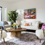
Let’s start with a good visual…
Picture two living rooms, one where everything is the same color and texture, and another where soft fabrics play against rough woods, where light colors pop against dark ones. Which one catches your eye?
Yup, the second one every time!
What is the purpose of contrast in interior design?
Contrast is like the spice in your favorite recipe! Without it, even the most expensive room can fall flat.
I learned this lesson the hard way when we redid our kitchen last year. I originally wanted everything to match perfectly. White cabinets, white countertops, white backsplash. My husband Tom looked at my mood board and just laughed.
“Where’s the oomph?” he asked.
He was right! After adding black hardware, wood open shelving, and a gorgeous blue island, the kitchen came alive. The contrast between these elements created visual excitement that makes me happy every morning when I grab my coffee.
Contrast works by creating tension between different elements. Think about mixing:
- Rough with smooth
- Matte with glossy
- Light with dark
- Straight lines with curves
- Natural with manufactured materials
A recent study by Color Psychology Today found that rooms with thoughtful contrast scored 78% higher in “visual interest” ratings from participants. People naturally crave that visual drama!
Why is it Important to Understand Material Balance?
Balance keeps your contrast from going haywire! It’s like having a really loud friend at a dinner party. They add excitement, but you need quieter folks to balance them out.
When we moved into our current house, the previous owners had gone wild with patterns. Floral wallpaper, striped curtains, chevron rug. It was like walking into a fabric store during an earthquake! Everything competed for attention, and nothing stood out.
Good material balance means giving each element room to breathe. If you’ve got a bold patterned accent wall, maybe your furniture should be more neutral. Got a statement sofa? Let it shine by keeping surrounding pieces simpler.
I find it helpful to lay out all my material samples on the floor before buying anything. This lets me see how they work together and adjust the balance before spending any money.
The Emotional and Psychological Effects of Contrast and Balance
Did you know your design choices actually affect your mood? No joke! The way we arrange contrast and balance in our homes can make us feel energized or calm, focused or scattered.
Adds Visual Interest
When I added a dark navy accent wall to my mostly white office, my productivity jumped. The contrast kept my eyes moving around the room, preventing that zoned-out feeling I used to get.
My neighbor Jen did something similar with textural contrast in her bedroom. She paired silky bedding with a chunky knit throw and a rough wooden headboard.
The room feels so much more interesting than when everything matched perfectly.
Creates Depth
Remember my friend Brian, who lives in that tiny apartment? He painted his back wall a deeper shade than the others, added some matt black duvet covers, and suddenly the room felt bigger!
The contrast tricked the eye into seeing more depth.
A UCLA study found that rooms with thoughtful contrast were perceived to be up to 15% larger than rooms of the same size without contrast. Pretty cool, right?
Highlights Features
Want to show off that gorgeous fireplace or built-in bookcase? Contrast is your best friend!
We painted our living room built-ins dark green against light walls, and now everyone notices them when they walk in. Before, they just blended into the background despite being an awesome architectural feature.
Creates Harmony
Balance keeps things feeling right. It’s hard to explain but easy to feel when it’s missing.
My sister’s living room felt off for years until we realized her furniture was all pushed to one side. By simply redistributing the visual weight, the whole room felt calmer and more inviting.
There are three main types of balance:
- Symmetrical – mirror images on each side
- Asymmetrical – different elements that have equal visual weight
- Radial – elements arranged around a central point
Most comfy rooms use a mix of these types!
Also read: Benefits Of Adjustable Beds (Adding Practical Comfort to Modern Homes)
Adds Visual Weight
Not all pieces carry the same visual impact. A black leather sofa feels “heavier” than a light linen one, even if they’re physically the same size.
When planning our family room makeover, I drew a quick sketch and shaded in the visually heavy pieces. This helped me see that everything was clustered on one side! No wonder the room felt tippy.
Rule of Thirds
Think of your room like a tic-tac-toe board. The points where lines cross are naturally pleasing focal points. I used this trick when hanging art in our hallway, and it made such a difference!
Golden Ratio
Nature loves the 1:1.618 proportion, and so do our eyes! I used this when deciding on the size of our coffee table compared to our sofa. Getting this proportion right makes rooms feel naturally balanced.
70-20-10 Rule
This is my go-to formula for materials. 70% of your dominant material, 20% of your secondary choice, and 10% accent material.
In our bedroom, that translated to 70% soft textiles, 20% wood tones, and 10% metal accents. The room feels balanced without being boring.
60-30-10 Color Rule
Similar idea but for colors! 60% of your main color, 30% secondary color, and 10% accent color.
My office follows this with 60% white, 30% navy, and 10% brass accents. The proportions feel right without me having to overthink it.
Common Mistakes and How to Avoid Them?
We’ve all been there! Here are some contrast and balance blunders I’ve made so you don’t have to:
- Too much contrast – Our first apartment looked like a checkerboard because I went overboard with black and white everything. The solution? Add middle tones to bridge the gap between extremes.
- Forgotten corners – I used to focus all my design energy on the central parts of rooms. Now I make sure to carry contrast and balance into every corner.
- Matching sets – Oh boy, my first sofa and loveseat set matched perfectly, down to the throw pillows! These days I break up sets for a more collected look.
- Scale problems – My tiny coffee table looked lost in front of our big sectional. Now I think about scale relationships when picking pieces.
- All one texture – My all-velvet living room from 2018 was so one-note! Now I make sure to mix up textures for more visual interest.
Also read: 10 Ways to Use a Multi-Purpose Murphy Bed in Any Room
Tips from the Experts for Perfect Home Makeover
I chatted with my interior designer friend Sarah about her best contrast and balance tricks:
“Start with something you love,” she told me. “A rug, a piece of art, anything with multiple colors and textures. Then pull your contrast and balance plan from that one piece.”
This worked amazingly when I used my grandmother’s vintage rug as inspiration for our dining room. The colors and patterns already worked together, making my job way easier!
Other pro tips:
- Use odd numbers for groupings
- Vary heights of accessories
- Mix new and old pieces
- Balance “look at me” pieces with quieter elements
- Step back and squint at your room – imbalances will jump out at you!
A quick word about small spaces. My buddy Carlos lives in a 500 sq ft studio that feels twice as big because he mastered contrast and balance. His trick? Keeping contrast high but limiting his color palette to just three colors. The room feels interesting without feeling cluttered.
Conclusion
So there you have it! Contrast and balance aren’t just designer buzzwords. They’re the secret sauce that makes a house feel like home.
Looking back at my friend Emma’s all-white living room disaster, the fix was pretty simple. We added a rich brown leather chair, some textured pillows, a few plants, and a striking black metal floor lamp. Now the room has life and personality!
Remember, rules are guidelines, not laws. Your home should make YOU happy above all else. But if you’re feeling stuck, playing with contrast and balance is often the magic fix your space needs.
What contrast or balance issues are you struggling with in your home? I bet you already have pieces you love that could be rearranged for better balance!
I’d love to see your before and afters if you try these tips!