I’ll be honest with you Sherwin Williams Alpaca (SW 7022) almost didn’t make it onto my walls as I didn’t like that color at first.
But the thing about Alpaca is that it’s beautiful warm greige that balances soft grays with warm beige undertones, and depending on the light it can look completely different.
The LRV (Light Reflectance Value) comes at 57, which means it’s got enough depth to feel comfortable without making a room dark.
What colors go with Sherwin Williams Alpaca? That’s exactly what kept me up at night when I first painted my bedroom. Because this isn’t just about choosing an alpaca and painting it on walls.
Alpaca is a versatile color that I’ve used in bedrooms, bathrooms, even tested it on my kitchen island and if you pair it wrong and those undertones will make it look dull.
This guide is everything I learned about color combinations, room-by-room pairings, and the mistakes I made so you don’t have to.
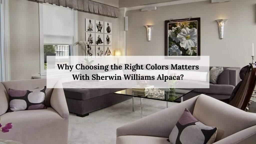
Why Choosing the Right Colors Matters With Sherwin Williams Alpaca?
I painted my daughter’s nursery with Alpaca SW 7022 and used a cream white trim and it was my worst decision ever.
The cream brought out these weird purple undertones that made the whole room feel off.
I repainted the trim two weeks later and it cost me an extra $80 and my Saturday.That’s when I realized undertones are EVERYTHING with this color.
Alpaca shifts depending on your lighting situation. North-facing rooms lean grayer and cooler while south-facing spaces with tons of natural light and shows warm taupe goodness.
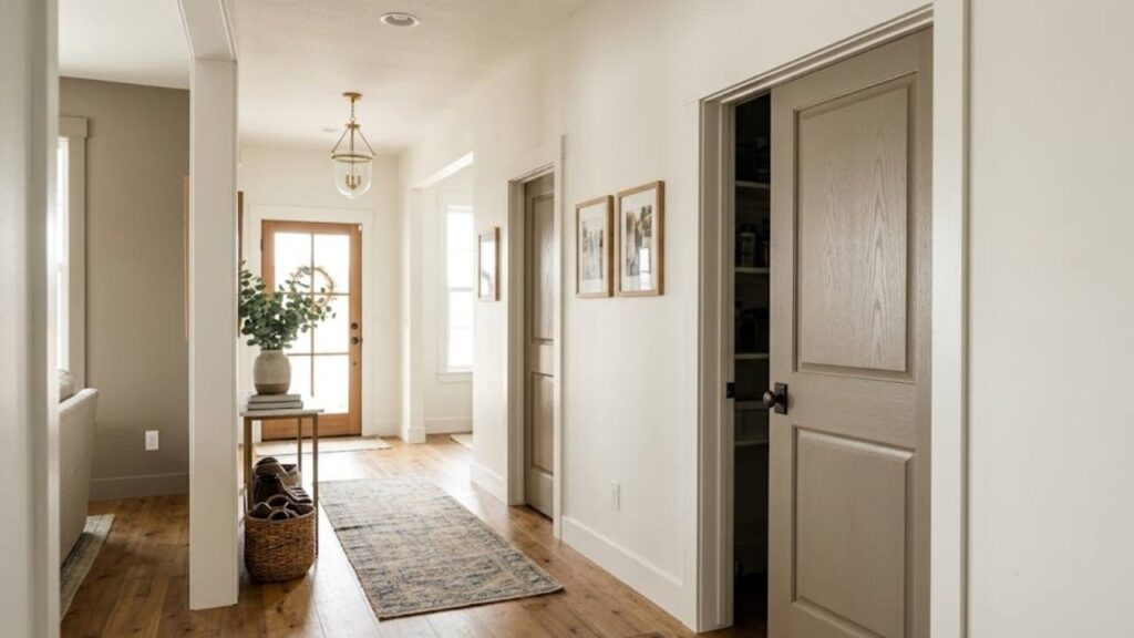
I’ve used Alpaca in:
- My primary bedroom (north-facing, looks totally different than I expected)
- Guest bathroom (no windows, had to really think about artificial lighting)
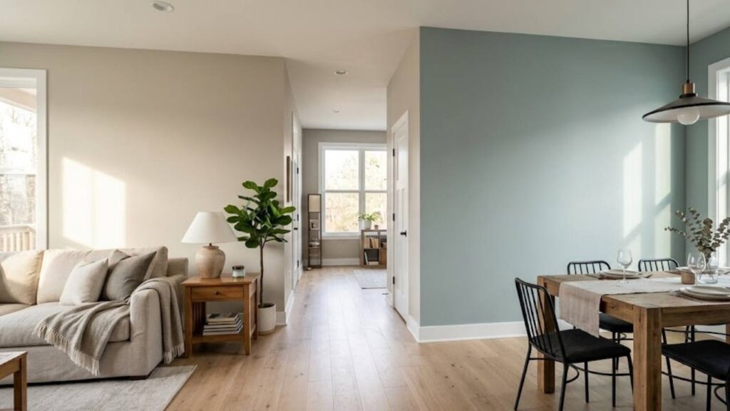
- Living room accent wall
- Almost on kitchen cabinets (chickened out last minute)
Each space needed different coordinating colors. The bedroom could handle deeper accent colors while the bathroom needed brightness to compensate for lack of windows.
Understanding Sherwin Williams Alpaca

SW 7022 is technically a warm gray, or greige, or both depending on what time of day it is and where you use it.
The complexity comes from the undertones – purple, taupe, brown, and sometimes a hint of pink and with many other different colors but that’s also why it works in so many different spaces.
When I first tested it in my bedroom, I swear it looked like a totally different color at 8am versus 6pm. Morning light made it lean more gray. Evening light made it look more like a warm taupe.
That LRV of 57 puts it right in the middle range. Not too light, not too dark. It reflects a decent amount of light but still has body and depth.
Compare that to something like Agreeable Gray at LRV 60 – Alpaca feels richer, more grounded.
Best lighting for Alpaca
Warm artificial lighting brings out the taupe while cool lighting emphasizes the gray. I use warm LED bulbs in spaces where I want it cozy (bedroom), and more neutral lighting in the bathroom where I need to see what I’m doing.
The versatility is real though as I’ve seen Alpaca work in modern farmhouse spaces, traditional homes, even contemporary interiors. It’s a chameleon that adapts to your style instead of fighting it.
What Colors Go With Sherwin Williams Alpaca
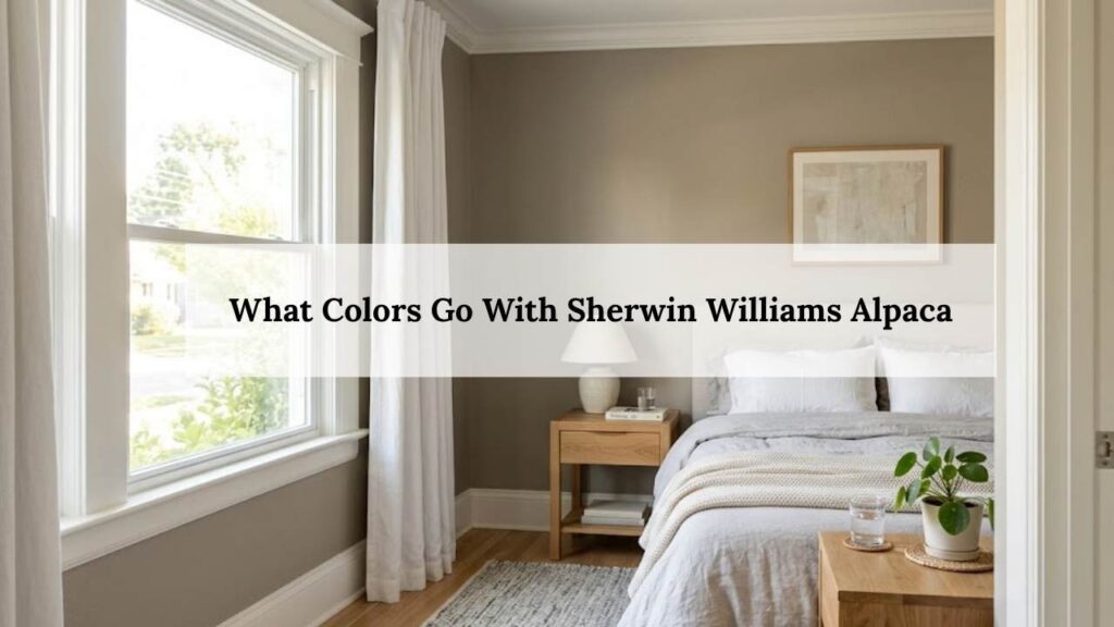
Sherwin Williams alpaca is a warm greige that changes subtly with light, making color pairing important.
Different colors create different looks with sherwin williams alpaca so choosing the right color helps in balancing undertones and keeps the space feel calm, comfortable and well put together.
Simply White (OC-117)
This is a Benjamin Moore color.
Simply White has this soft warmth that doesn’t compete with Alpaca’s undertones. When I used it on trim in my bedroom (the Alpaca room), it created just enough contrast without that harsh white-box feeling.
LRV is around 89, so it’s BRIGHT. But not sterile bright.
It works best in rooms with good natural light. I tried it in my windowless bathroom and it felt too stark against the Alpaca walls.
Swiss Coffee (OC-45)
Another Benjamin Moore that I’m obsessed with for ceilings.
It’s warmer than Simply White, almost creamy but not so cream that it clashes. The LRV hovers around 83-84. When paired with Alpaca walls, it creates this cozy, enveloping feeling.
I used this combo in my living room and multiple people have asked me what system I used to pick colors and there was no system. I just used it on trial and error and one repaint method.
The trick with Swiss Coffee is lighting – it needs warm light to really shine. Under cool LED bulbs it can look dingy.
Simple White (SW 7021)
THIS is the Sherwin Williams white I should’ve used first.
Simple White (not Simply White) sits right next to Alpaca on the SW color strip. LRV of 87 means it’s bright without being aggressive.
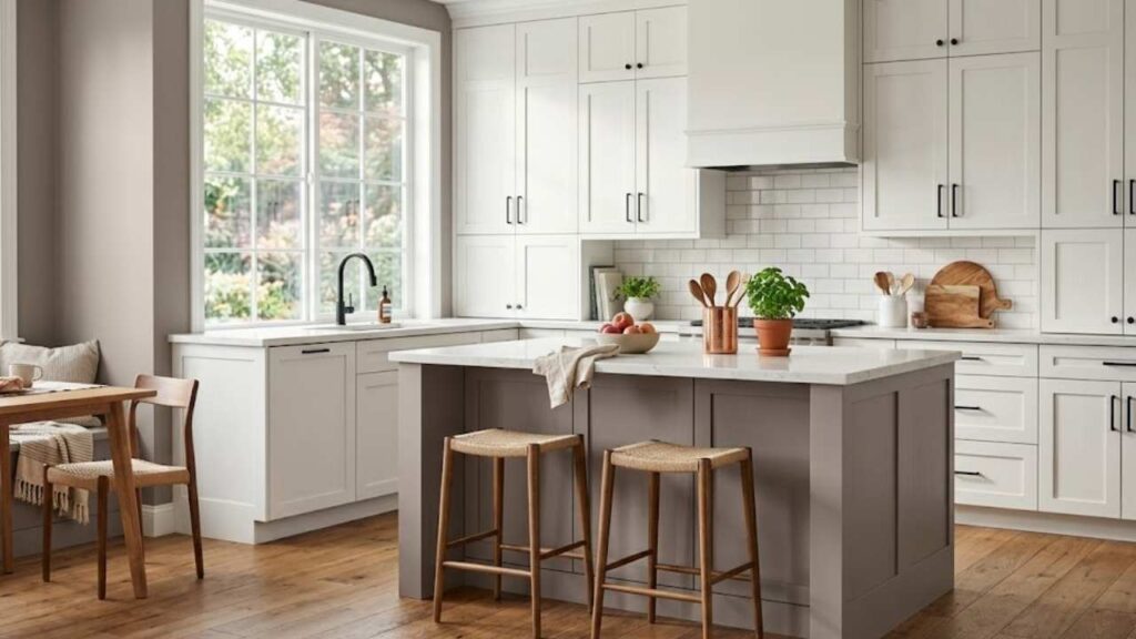
I finally used this on my kitchen cabinets with Alpaca on the island and the coordination looked absolutely perfect like they were literally designed to go together.
Great for trim, ceilings, or cabinets. Doesn’t fight the purple undertones at all.
Accessible Beige (SW 7026)
When you want to go warmer instead of lighter you can use accessible beige
Accessible Beige has an LRV of 58 – almost identical to Alpaca. But it’s WARMER. Like noticeably warmer with more beige and less gray.
I used this in my hallway while Alpaca lives in the bedroom, and the transition feels smooth. Not matchy, but coordinated.
From what I have noticed , in south-facing rooms, this can look very beige though some people love that.
Tricorn Black (SW 6258)
Tricorn Black is the color when you need confidence.
I put Tricorn Black on my front door with Alpaca on the exterior siding. The contrast is dramatic and LRV of 3 means this is seriously dark.
Inside, I’ve seen it work beautifully as an accent in kitchen island base cabinets, interior doors, even a bold accent wall in a living room where Alpaca is on the other walls.
You need good lighting for this pairing and don’t use this color combination in a dark room.
Pewter Green (SW 6208)
This one surprised me.
Pewter Green has gray-green tones that feel organic next to Alpaca. I used it on my bathroom vanity (Alpaca walls) and it created this spa-like vibe that I wasn’t expecting.
The LRV is around 38, so it’s medium-depth. Works as a cabinet color, accent wall, or even exterior shutters if you’re using Alpaca on your house.
Those who love sage green lovers, this is your best color with Alpaca.
Comfort Gray (SW 7042)
Cooler than Alpaca but still warm enough to play nice.
I tested Comfort Gray (LRV 61) in my office as a potential ceiling color with Alpaca walls and ended up going a different direction, but I loved how the cooler gray balanced Alpaca’s warmth.
Best for open-concept spaces where you want subtle room definition without actual walls. Use Comfort Gray in one area, Alpaca in another, and watch them coordinate beautifully.
Sea Salt (SW 6204)
Sea Salt is that blue-green-gray everyone either loves or hates. LRV around 63-64.
I haven’t personally used this with Alpaca, but my sister did in her coastal-vibe living room.
Alpaca on the main walls, Sea Salt in the adjoining dining area. The soft blue-green keeps things cool while Alpaca adds warmth.
Sea salt works best if you like a beachy feel.
How to Decorate Your Home With Sherwin Williams Alpaca
Alpaca looks completely different depending on the room, the light, what colors you pair it with, and the mood you’re in when you look at it.
Different colors look different in different areas of your home and give different looks. Different lighting and surroundings are required to to create a different look with alpaca.
Let me break down what I’ve learned room by room.
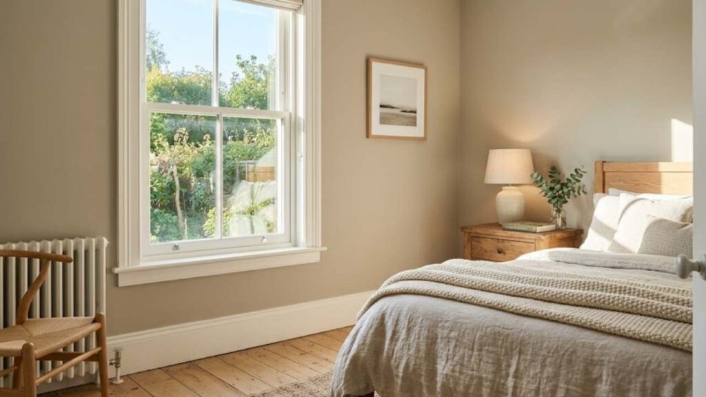
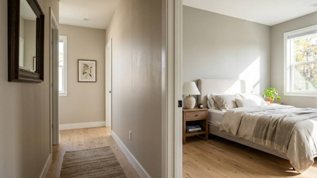
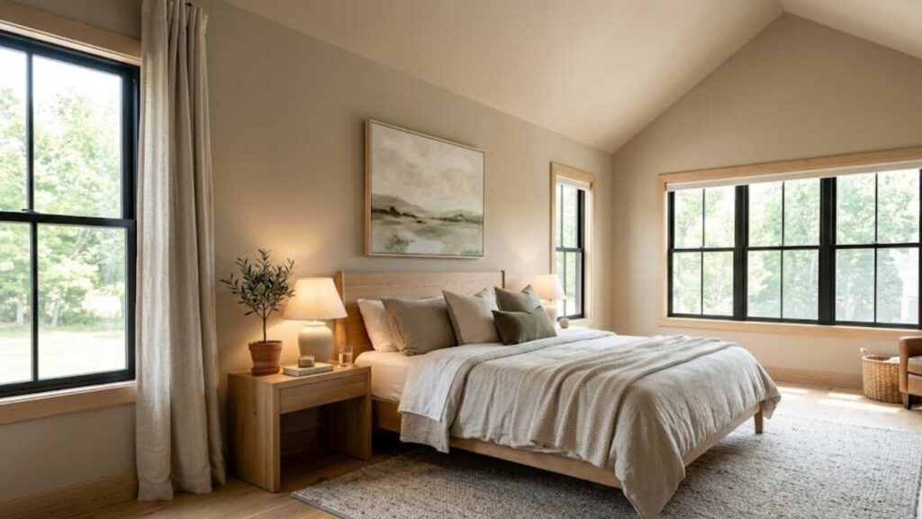
Bedroom
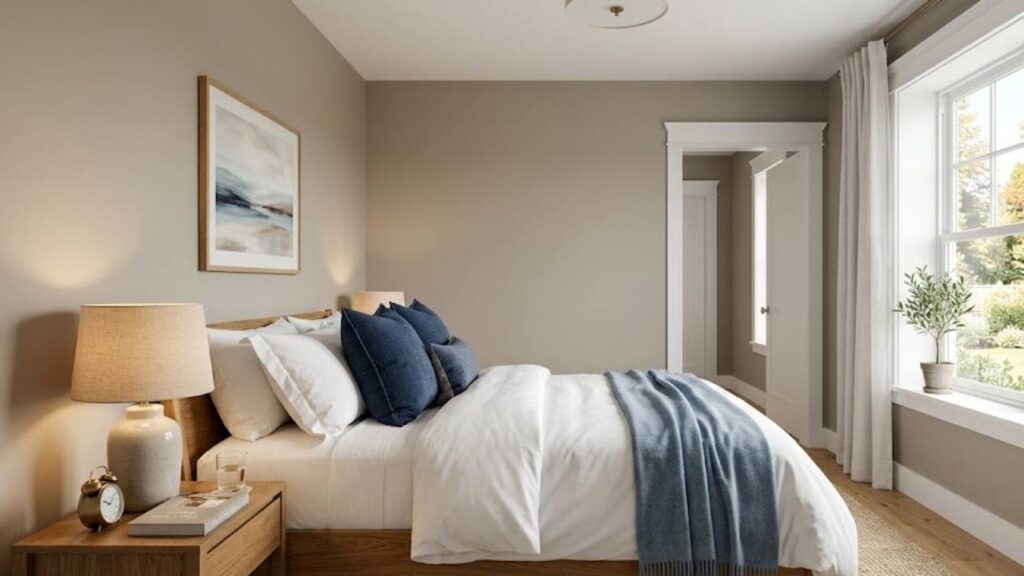
Bedrooms are where Alpaca really shines – especially if you want cozy without dark.
I paired mine with Pure White (SW 7005) trim and it’s perfect. The warm greige walls feel enveloping but the white trim keeps it from feeling cave-like.
For accent colors, I brought in deep navy pillows and a dusty blue throw blanket. The cool blues balance Alpaca’s warmth.
Lighting tip: Use warm bulbs in bedside lamps . Alpaca looks good in that warm glow – all the taupe undertones come through and it feels like a boutique hotel.
I made the mistake initially of using cream bedding. Looked dingy against the walls. Switched to crisp white bedding and suddenly the whole room felt pulled together.
If your bedroom is north-facing, expect Alpaca to lean grayer. That’s actually not bad – just know what you’re getting.
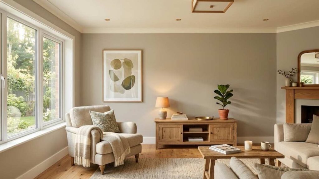
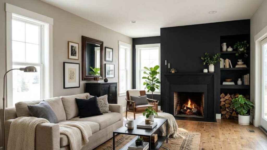
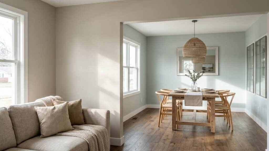
Living Room
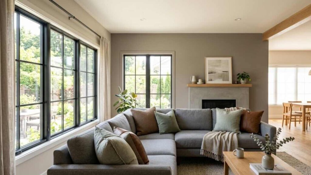
Living rooms are trickier because of all the variables – furniture, different light sources, and open floor plans.
I used Alpaca on one accent wall in my living room with lighter beige on the other walls. Brought in Accessible Beige for the adjacent walls and the flow is seamless.
The sectional is a medium gray, which creates nice contrast. Throw pillows in sage green and warm brown tie everything together.
What I’d do differently: The ceiling. I left it builder white but I think Swiss Coffee would’ve felt more cohesive.
Natural light is huge here. My living room has big south-facing windows and Alpaca looks warm and taupe-y most of the day. In the evening with lamps on it looks even warmer.
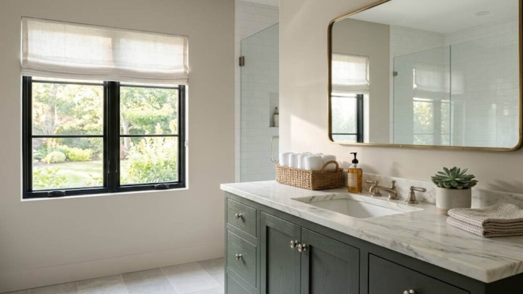
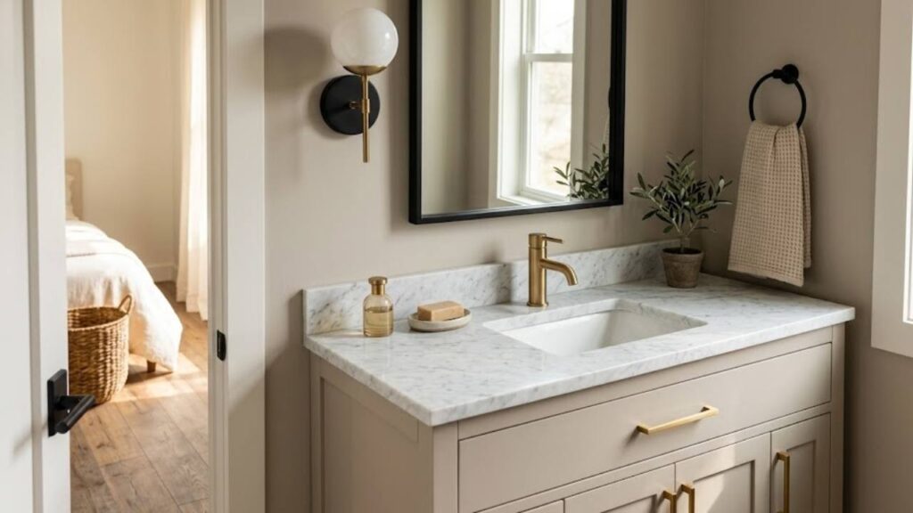
Bathroom
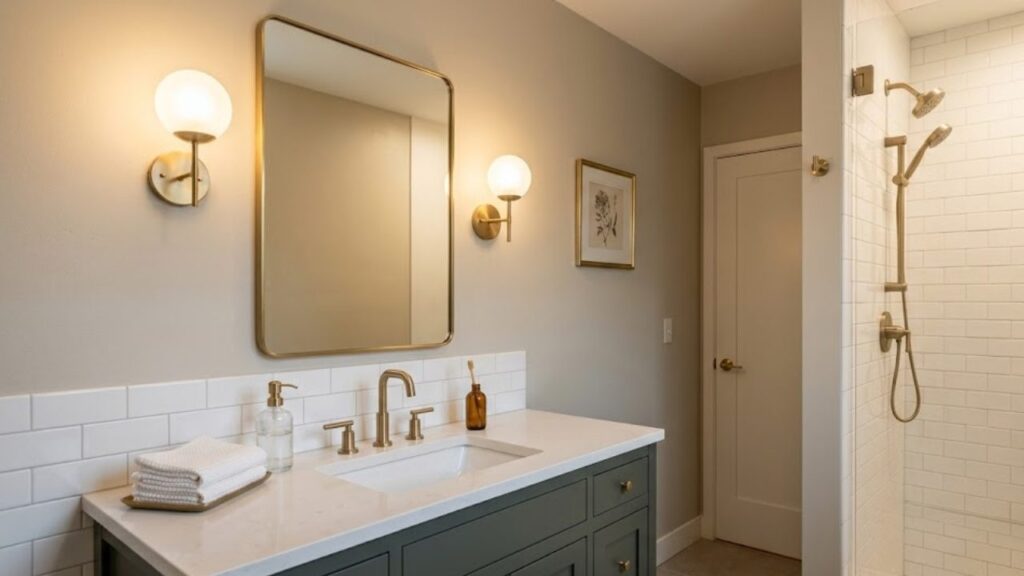
Bathrooms with Alpaca need careful planning.
I have a windowless guest bathroom with Alpaca walls. I paired it with:
- White subway tile (bright white, not cream)
- Pewter Green vanity
- Brushed brass fixtures
- Lots of warm lighting
The warm lighting is non-negotiable in a windowless bathroom. Cool LED bulbs made the Alpaca look muddy and sad while warm LEDs bring it to life.
For bathrooms with windows, you have more flexibility. I’d still avoid cream whites though – stick with true whites or soft off-whites.
Kitchen
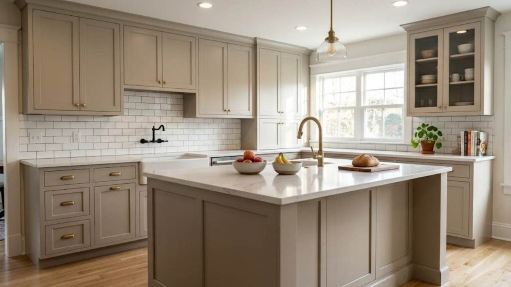
I almost painted my kitchen island Alpaca.
Best kitchen use for Alpaca:
- Cabinet color (uppers or lowers)
- Island base
- Walls if you have white or cream cabinets
If you do Alpaca cabinets, go with white or light countertops. The medium-depth of Alpaca needs brightness somewhere.
I’d pair it with:
- White subway tile backsplash
- Light wood or white oak flooring
- Brass or black hardware
- Pure White or Simple White for trim
Lighting in kitchens is usually cooler/brighter, which means Alpaca will show more gray. That’s actually nice in a kitchen as it keeps it from feeling too warm or dated.
Ceilings
Alpaca is too dark for most ceilings.
I know painting your ceiling the same as the wall’s trend is big right now and it can work. But with Alpaca’s LRV of 57, you’re bringing down the perceived height of your room.
If you have really high ceilings (9+ feet) and tons of natural light then you can go for it as it looks really smooth and comfortable.
For normal 8-foot ceilings, stick with:
- Swiss Coffee for warmth
- Simple White for brightness
- Pure White if you want contrast
I tested Alpaca on my bedroom ceiling and immediately knew it was wrong and felt like the ceiling was sitting on my head.
Exterior
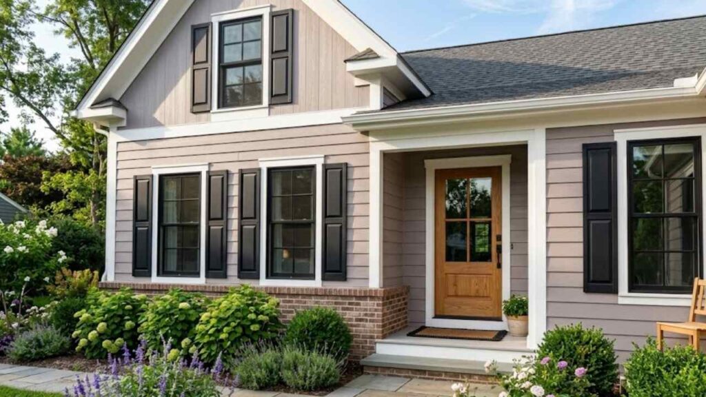
I tested Alpaca on the exterior of my house.
The purple undertones come out to play on exteriors. Especially in morning and evening light. Like, very noticeably purple-gray.
If you love that – great! I actually think it’s beautiful with:
- Tricorn Black shutters
- White trim (Westhighland White or Pure White)
- Natural wood front door
But test it at every time of day. I mean morning, noon, afternoon, evening, and overcast. Alpaca is moody on exteriors.
Works on stucco, siding, brick but that purple undertone doesn’t care what surface it’s on. It’s coming through.
Doors
The interior doors in Alpaca look extremely beautiful while in the exterior front door you can choose it if you want to but it will look great on that too.
I painted one interior door Alpaca as a test (it’s the door to our utility closet so low stakes). Against white walls, it looks sophisticated and subtle.
For front doors, I prefer something with more personality – Tricorn Black, a bold navy, even a fun color. Alpaca feels a little boring for a front door in my opinion.
But interior doors in a home where Alpaca is your main wall color. Paint them the same as it creates flow and makes trim work easier.
Metal and Wood Tones That Match Alpaca Paint
Metals that work:
Brushed brass is my favorite with Alpaca. The warm gold tones pick up the warm undertones in the paint. I used brass cabinet pulls in my bathroom and door handles throughout the house.
Matte black is a close second. Creates beautiful contrast without feeling too harsh. Works on light fixtures, cabinet hardware, and faucets.
Avoid: Shiny chrome as it feels cold and dated against Alpaca’s warmth. Brushed nickel is better if you must do silver-toned metals.
Wood tones:
Light oak and maple feels fresh and modern with Alpaca while medium walnut feels richer and more traditional but still coordinated.
Avoid: Orange-toned woods like cherry or golden oak. They clash with the purple undertones in Alpaca.
I learned this when I tried to convince myself my existing cherry dresser would work in the Alpaca bedroom and it didn’t work.
White oak is probably the best wood tone with Alpaca. It’s light, has gray undertones, and feels current.
Color Comparison
Comparing colors is how I finally understood what Alpaca actually is.
You can’t know a color in isolation. You need context.
I painted comparison boards – Alpaca next to its closest competitors – and it was SO helpful. Like, genuinely changed how I saw the color.
Sherwin Williams Alpaca vs Alabaster
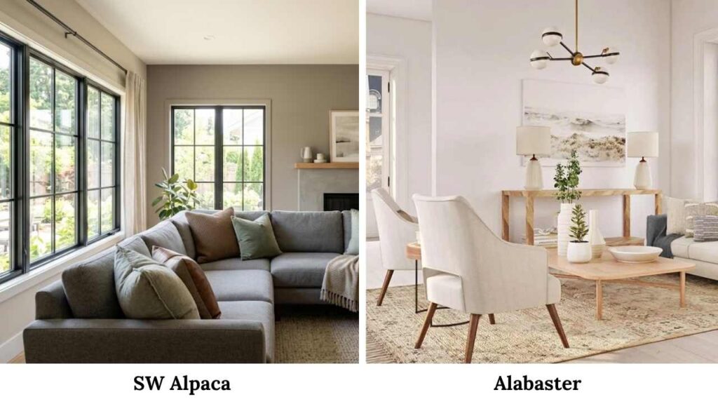
Alabaster (SW 7008) is much, much lighter.
Alpaca: LRV 57, warm greige, medium depth Alabaster: LRV 82, soft white with warm undertones
I actually use these together – Alabaster on main walls, Alpaca as trim for a reversed traditional look.
Alabaster needs warm or natural light to avoid looking flat while alpaca is more forgiving with lighting.
Best uses:
- Alabaster: Main wall color in bright rooms, trim color
- Alpaca: Medium-depth walls, cabinets, accent color
They’re not competitors – they’re companions.
Sherwin Williams Alpaca vs Agreeable Gray
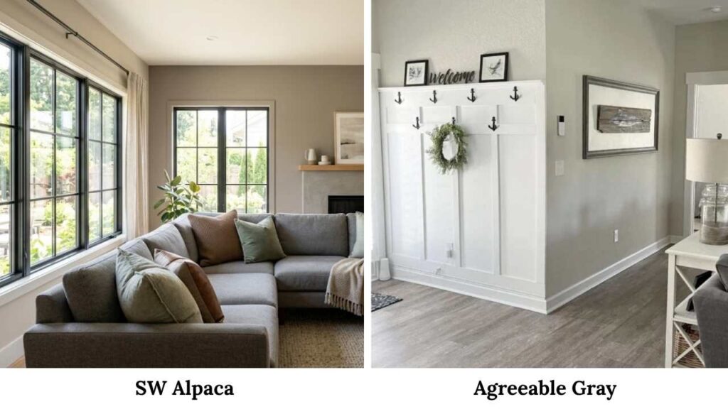
THIS is the real comparison everyone wants.
Agreeable Gray (SW 7029) is the most popular Sherwin Williams neutral. LRV 60, so slightly lighter than Alpaca.
Here’s the difference:
Agreeable Gray has more balanced, neutral undertones. It’s a true greige that doesn’t lean super warm or cool.
Alpaca has those purple-taupe undertones that make it more complex but also more specific.
In my bedroom, I had both samples up for days and agreeable Gray felt safer while alpaca felt more interesting.
I went with Alpaca and don’t regret it.
But if you have a lot of existing finishes to coordinate with (flooring, countertops, etc.), Agreeable Gray is more forgiving.
Best for Agreeable Gray: Open concepts, whole-home color, safe choice
Best for Alpaca: Specific rooms, when you want more character, when you like those purple undertones
What Colors Go With Sherwin Williams Alpaca: Common Mistakes to Avoid
Mistake 1: Using cream whites
Cream whites bring out purple undertones in the worst way. Stick with true whites or soft whites like Simple White.
Mistake 2: Not testing in your lighting.
Get samples. Paint them on boards or directly on your wall. Look at them for days in different lighting.
I use Samplize peel-and-stick samples now – so much easier than painting test patches.
Mistake 3: Ignoring room exposure
North-facing room looks like grayer Alpaca while South-facing room looks like warmer, taupe-ier Alpaca
My north-facing bedroom Alpaca looks totally different from my sister’s south-facing living room Alpaca. Same paint. Different rooms. Different colors (basically).
Mistake 4: Pairing with blue-heavy grays
Cool grays and Alpaca don’t get along. The warm undertones in Alpaca clash with cool grays and everything looks muddy.
Stick with warm grays (like Comfort Gray) or go full contrast with white.
How to avoid these:
Test samples for at least 3 days in morning, afternoon, evening light. Look at them with your existing furniture, flooring, and finishes and see when its working and when not.
Conclusion
Understanding Sherwin Williams Alpaca (SW 7022) is like understanding a moody friend – you have to know what brings out the best in them.
The warm greige base, that LRV of 57, those sneaky purple-taupe undertones, they all work together to create something more interesting than your standard neutral. But only if you pair it right.
What colors go with Sherwin Williams Alpaca? From what I have noticed that pure White or Simple White for trim, Accessible Beige for warmth, Tricorn Black for drama, Pewter Green for earthiness.
In bedrooms, keep it cozy with warm lighting and soft blues, in bathrooms, add brightness with white tile and warm metals, in kitchens you need careful balance – white cabinets or countertops to offset Alpaca’s depth.
The biggest mistakes I see (and made myself) are using cream whites, ignoring your lighting situation, and not testing long enough. Alpaca reveals itself slowly as it needs time.
I’ve used this color in four different spaces now and I’m still not tired of it. That’s saying something for someone who repaints rooms like other people rearrange furniture.
FAQs on What Colors Go With Sherwin Williams Alpaca
Pure White (SW 7005), Simple White (SW 7021), Accessible Beige (SW 7026), Tricorn Black (SW 6258), Pewter Green (SW 6204), and Comfort Gray work beautifully. Stick with true whites instead of creams for trim.
Both – it’s a greige. Leans more gray in north-facing rooms and cooler light, more beige/taupe in south-facing rooms and warm light. Those purple-taupe undertones make it shift throughout the day.
Warm. Despite the gray base, the purple-taupe-brown undertones keep it on the warm side of the neutral spectrum. It’s warmer than Repose Gray but cooler than Popular Gray.
Warm whites, soft greiges, muted greens (especially sage and Pewter Green), dusty blues, warm grays, deep navy, and Tricorn Black. Brass metals and light oak woods are perfect pairings.