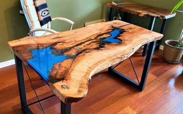
If you’ve ever walked into a room and felt something shift inside you—maybe a little warmth, a bit of calm, or even a spark of curiosity—there’s a good chance color had something to do with it.
And when it comes to epoxy furniture, color doesn’t just sit quietly on the surface.
It moves, reflects, softens, and sometimes even plays tricks with the light.
That’s why people who work with resin often talk about pigments the way painters talk about their palettes: every shade carries mood, temperature, and personality.
Some designers rely on intuition, others study trends, and a few simply scroll through examples from makers they admire.
Even looking at how studios like ThunderWood experiment with tone and texture can give you an idea of how color behaves once it meets resin.
It’s fascinating how much can change with just a slightly warmer blue or a softer edge between two shades.
The Emotional Weight of Color
Colors don’t ask permission—they go straight to your senses.
A deep green resin river can make a room feel grounded, almost like stepping into a quiet forest.
In contrast, a bright, playful turquoise might lift the whole mood of a space, especially one that felt a little flat before.
Think of a few simple examples:
- A cool blue table can make a sunny room feel crisp and refreshing.
- A warm amber line running through walnut can turn the piece into something that feels familiar and comforting.
- A muted gray or sand tone blends so easily that you barely notice it—until you do.
- And of course, dramatic pigments like deep black or metallic gold can bring a sense of movement or mystery.
One interesting thing about resin is that it doesn’t behave like paint on a wall.
Morning light might soften a pigment until it looks almost transparent.
Evening light can make that same color look thicker, deeper, sometimes entirely different.
How Pigments Actually Behave in Resin
People often assume pigment is just pigment, but anyone who’s mixed resin knows it’s not that simple.
Some powders bloom outward the moment they touch the liquid. Others sink. Some stay exactly where you put them—until they don’t.
A few types behave especially distinctively:
Opaque pigments create a strong, steady block of color. They’re dependable and bold.
Translucent tints let light pass through, so the color changes with the room.
Pearlescent and metallic powders swirl like smoke or water and make every pour slightly unpredictable.
Pastels land softly, almost cloud-like.
And resin itself isn’t passive. Temperature, curing time, and even the shape of your mold determine how these pigments settle. Two artists can mix the same shade and still end up with two entirely different pieces.
Finding Balance Between Wood and Color
Most epoxy furniture isn’t all resin. It’s a conversation between the wood and the pigment, and one shouldn’t drown out the other.
A few patterns I’ve noticed over time:
- Walnut and deep blues or emerald tones tend to look like they were made for each other.
- Ash pairs well with smoky grays or gentle white tints.
- Oak loves warm earthy colors—ambers, muted greens, soft browns.
But it’s more than matching tones. Designers often look at the grain first. A soft, delicate pattern might need a quieter resin tone. A bold grain can handle a daring color without feeling overwhelmed.
The trick is to make the resin feel like part of the story, not the whole story.
Light: The Element Nobody Talks About Enough
Light is the invisible collaborator in epoxy art. You can design a piece under bright workshop lamps, only to bring it home and realize the color has changed entirely.
A few things happen often:
- Natural daylight makes translucent pigments glow.
- Warm indoor bulbs deepen browns, reds, and golds.
- Cool light sharpens greens and blues.
- Spotlighting makes metallic pigments shimmer like they’re still moving.
So choosing a color isn’t just about “what looks nice.” It’s also about imagining the life the piece will have once it lives in someone’s home.
When Color Tells a Story
Some epoxy pieces feel like they capture movement. The right pigments can look like a wave frozen in mid-crest, or like smoke swirling under glass. The story changes based on the shade.
A dark blue might recall deep water.
A marbled black-and-gold pattern can feel almost cosmic.
Soft lavenders feel gentle, personal, and calming.
People often choose colors based on memories or places they love. That’s why no two resin pieces are ever identical—not even if the artist tries.
Choosing Colors for Your Own Space
If you’re trying to pick colors for a future piece, it helps to start simple:
Look at how the room already feels.
Some colors clash. Some elevate. Some disappear in the best possible way.
Consider the room’s lighting.
It will change the resin more than you expect.
Think about longevity.
A neon table looks wonderful on Instagram, but living with it every day is another story.
Let the wood guide you.
Resin should support the natural material, not overpower it.
Color as a Living Part of Design
The more time you spend around epoxy furniture, the more you realize that color isn’t just decoration—it’s a living part of the room.
It responds to light, interacts with wood, and nudges the atmosphere in one direction or another.
Pigments shape how we experience a space long before we consciously analyze it.
They can make a room feel bigger, calmer, warmer, moodier, or more energetic. And when handled thoughtfully, resin gives these colors a life that’s difficult to replicate with any other material.
If you want to explore how different palettes behave in resin and how color and wood come together, the work shared by ThunderWood Studio can offer a sense of how expressive epoxy furniture can be when color is treated not as an accessory but as an essential part of the design.


