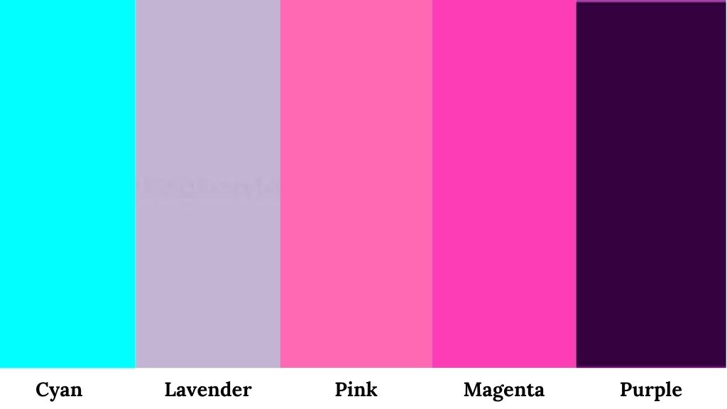
Cyan is a super bright, refreshing blue-green color that sits right between blue and green on the color wheel, and it’s been one of my favorite colors to work with for the past few years.
I’m talking about that crisp, electric hue – hex code #00FFFF that reminds of tropical water or a really clear summer sky.
But the most difficult thing is deciding on what color goes with cyan and how do we make them work together.
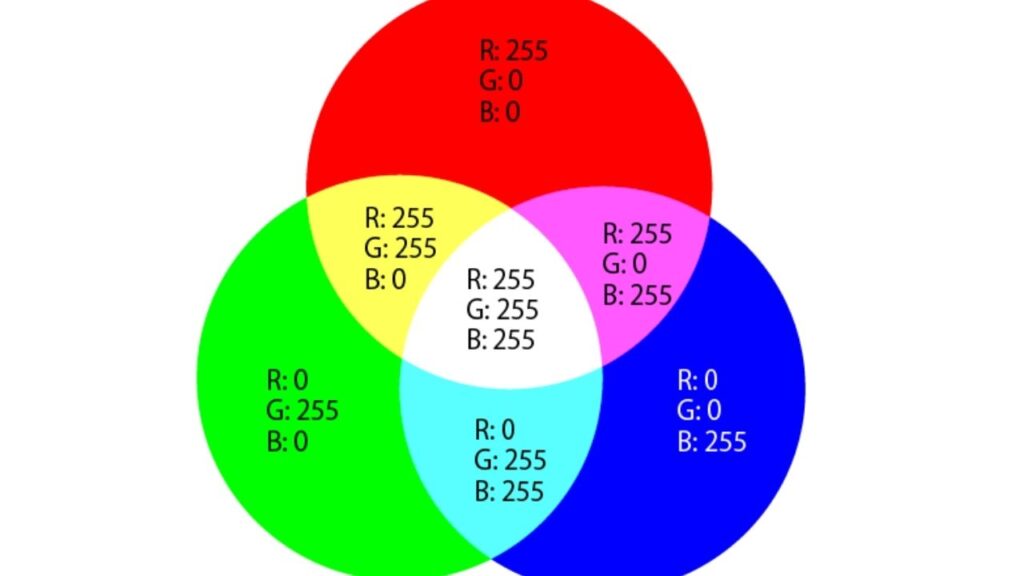
First, let’s go over the technical stuff: RGB is 0% red, 100% green, 100% blue. HSL breaks down to 180°, 100%, 50%, and CMYK is 100, 0, 0, 0 which basically makes cyan one of the primary colors in printing.
Cyan works with every color if you pair it right with white, black, yellow, green, and pink for classic, refined, bold, harmonious, and for great looks.
The thing about cyan is that it’s bright and demands attention.
Let’s look at all the color combinations to understand what colours go with Cyan not in theory, but in real applications too.
So, without any further delay let’s begin with this guide to help you with the right cyan complementary colors.
What Color Goes with Cyan: A Full List of Colors
Now what colours go with cyan depends heavily on how you use it.
Cyan works because it’s a cool-toned color that brings freshness, calm, vibrant and energy without being warm.
For cyan hair, clothing in black, white, or even soft pinks looks great and let the hair be the star.
Cyan dresses work beautifully with nude or gold accessories or go bold with red heels that complementary color contrast is perfect
For cyan shorts or pants, pair with white tops for casual looks, or navy and gray for polished looks.
Neutral Colors
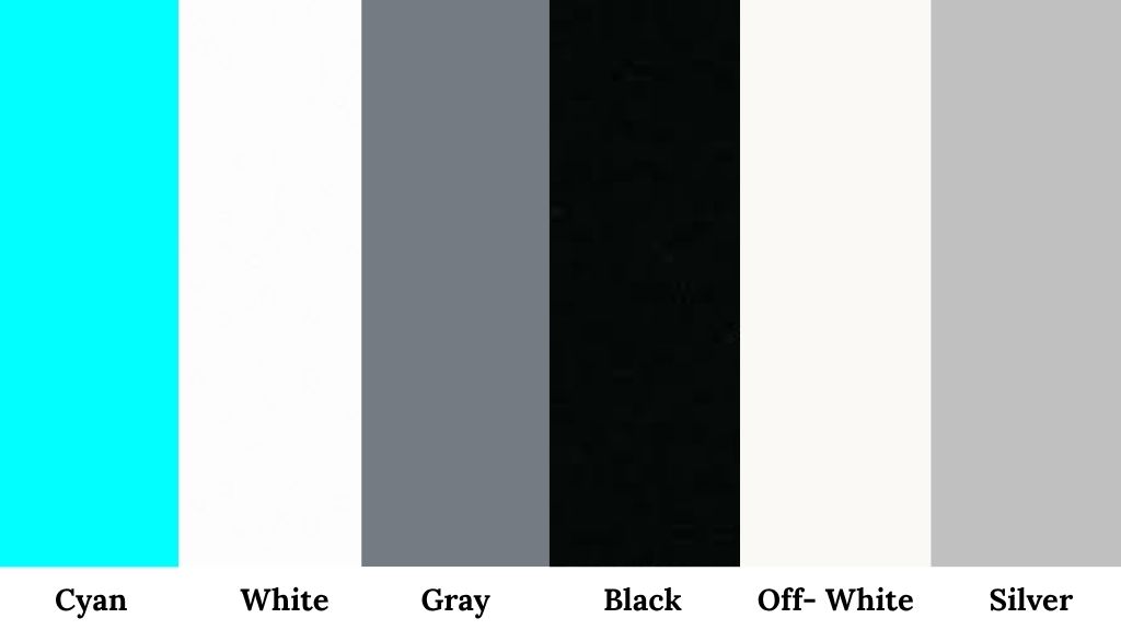
Neutrals are the safest color to pair with cyan as they balance out cyan’s intensity without competing for attention.
White is probably the most popular pairing. White and cyan together create a clean, modern, almost spa-like feeling.
I painted my bathroom with white walls and added cyan towels and a shower curtain and it gave instant coastal looks without being too themed.
Gray (especially cool gray) looks refined. If you’re worried cyan is too playful, gray tones it down. I used a light gray wall with cyan accent pillows in my bedroom, and it feels great.
Black creates drama. Black and cyan is bold, modern, little edgy and is great for fashion.
Off-white or beige adds warmth that cyan lacks. This was my solution when cyan felt too cold in my living room therefore I added some beige elements and suddenly everything felt more inviting.
Silver metallics work really well, especially in modern or contemporary settings.
I used silver frames with cyan mats for my photo wall, and the combo feels aesthetically good.
Best uses for neutral + cyan combinations:
- Interior walls (white or gray base with cyan accents)
- Fashion basics (neutral clothing with cyan accessories or vice versa)
- Professional settings where you need cyan but can’t go too bold
- Hair styling (if you have cyan hair, neutrals in your wardrobe are your best friend)
Contrast Colors
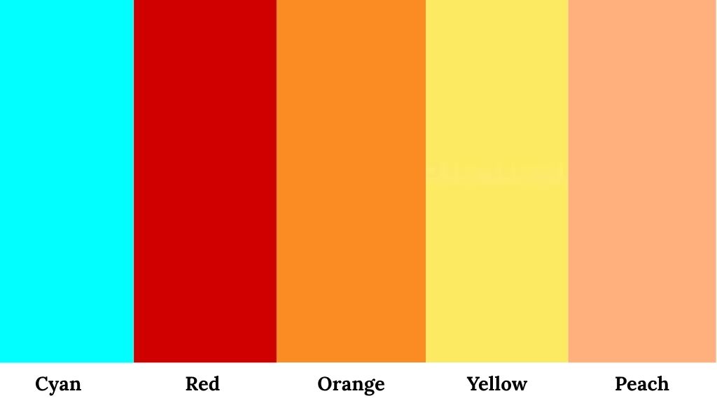
Contrast colors create a bold look and when paired with cyan gives a great and magnificent look with great visuals.
Cyan’s complementary color is red as they sit opposite on the color wheel. Maximum contrast equals maximum energy.
I tried red and cyan in my kitchen once and it was overwhelming, and too much visual stimulation. But for small doses like a cyan dress with red lipstick also actually works.
Orange and coral are softer versions of that warm contrast, it’s tropical without being dull, warm without losing cyan’s coolness.
I used this combo for my daughter’s bedroom – cyan walls with coral bedding and white furniture and everyone who sees it loves it.
Yellow is another contrast color that pairs beautifully. Yellow and cyan together feel happy, energetic, summer-y and are great for casual fashion.
I have cyan shorts that I pair with a soft yellow t-shirt and it has become my favorite outfit.
Peach is gentler than orange but still provides that warm contrast and works really well in interior design if you want something fresh but livable.
For cyan color combination dresses with contrast colors:
- One bold piece, keep everything else neutral
- In interiors, use the 60-30-10 rule
- For fashion, contrast colors work best in spring and summer
Cool Colors
This is Cyan’s comfort zone because cool colors create harmonious and cohesive looks.
So when deciding between what color go with Cyan, Blue is cyan’s closest choose and for more flexibility, you can go for different blue shades as they all work differently, creating a unique look each time:
- Navy blue grounds cyan and makes it more refined
- Light blue creates an ocean-like, monochromatic look
- Teal adds depth
I painted my home office with navy blue built-ins and cyan accents, and it’s my favorite room in the house as it is calming.
Green also pairs naturally with cyan since cyan contains green. Mint green with cyan is not too loud and refreshing. Dark green creates contrast while staying cool-toned.
Use cool color combinations when:
- You want a calming, cohesive environment (bedrooms, bathrooms, offices)
- You’re going for a water/ocean/nature theme
- In fashion, when you want a pulled-together monochromatic look
- You need something that feels balanced and peaceful
When it comes to fashion and clothing, what colours go with cyan clothes is something I’m always left wondering.
So I go with the most safest choice, which is cyan and navy together because this combination doesn’t need thinking time and is ready to use instantly.
Soft Colors
Soft colors are underrated with cyan. They add femininity and depth without fighting for attention.
Lavender and cyan look beautiful and pretty. I used this in my craft room with cyan storage boxes with lavender walls and It felt creative and calm at the same time.
Pink softens cyan’s intensity. This combo feels modern and fresh.
Magenta is bolder than pink but still works because both are on the cool side. It’s playful and gives 80s/90s looks but in a good way.
Purple (lighter shades) adds dimension and you can use this when cyan alone feels flat or one-dimensional.
Soft colors work best with cyan when:
- You want something feminine but not overly sweet
- In bedrooms or creative spaces
- Fashion-wise, for spring or dressy occasions
- You need to soften cyan’s electric quality
What color goes with cyan: Best Cyan Color Combinations for Different Uses
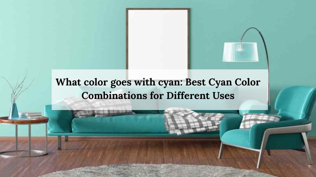
Cyan behaves differently depending on where you use it.
The cyan that looks perfect on a screen might look totally different on your wall. The cyan shirt that photographs beautifully might clash with your skin tone in person.
And cyan in print works differently because of how CMYK printing works.
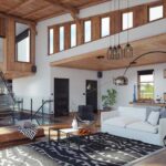
Interior and Housing
Cyan in interiors is where I used the most of cyan.
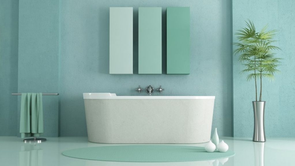
In bathrooms cyan naturally evokes water, so it is a good choice and makes sense here but don’t go all cyan because it looks like living inside a swimming pool and I have already made that mistake in our first house.
You can go with white subway tiles with cyan grout or white everything with strategic cyan accents and feels spa-like and expensive.
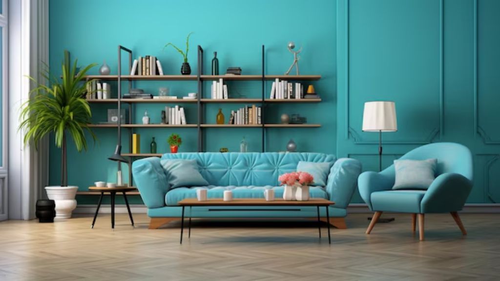
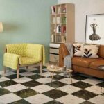
Living rooms need careful handling. I used cyan as an accent wall and kept everything else neutral like gray couch, white trim, natural wood and the cyan wall becomes the focal point without overwhelming.
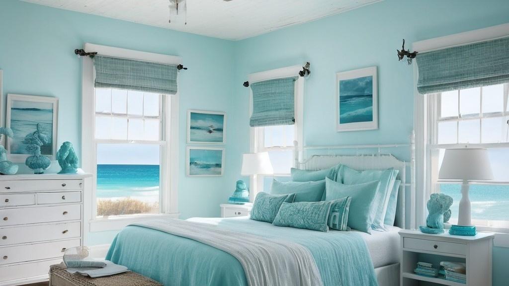
Bedrooms can go either soft or bold. For adults, try navy and cyan with white bedding and for kids, cyan with yellow or orange is fun and energetic.
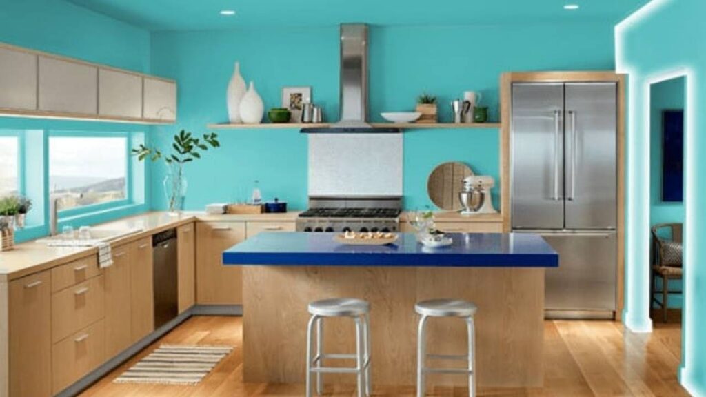
Kitchens with cyan bar stools or small appliances look extremely great and cool.
The finishing effect of cyan in interiors is that it opens up space, makes things feel fresh and clean, and adds a modern edge but too much creates coldness.
Styling and Fashion
Fashion is where most mistakes with cyan are made.
Cyan color combination dress for women: pair with nude heels and gold jewelry for elegant or go bold with red accessories for drama. I wore a cyan dress to a wedding last year with rose gold accessories and it looked great and prosperous.
For men, cyan shirts work best with:
- Khaki or gray pants (safe, classic)
- Navy pants (more interesting)
- Black pants (bold, modern)
- White shorts in summer (casual, clean)
My husband’s question WAS What color goes with a cyan shirt when I bought him a cyan polo and i said gray pants, white pants, or navy shorts while black pants made it too intense for his style.
Cyan color matching pants – if you have cyan pants, keep your top neutral like white, gray, black, or navy and let the pants be the star
Styling tips from my experience:
- Cyan works better in casual settings than formal (unless it’s a dress)
- For everyday wear, use cyan as the accent, not the main piece
- Cyan fades faster in clothing, so buy quality or accept the faded look
- Accessories in cyan (shoes, bags, scarves) are easier than full outfits
Printing
Printing is the technical side where cyan is one of the four primary colors in CMYK printing – that’s cyan, magenta, yellow, and black (the K).
When you’re printing anything like brochures, business cards, posters – bright cyan at 100% gives you that pure look. Mix it with magenta and yellow and you can create basically any color.
Most common cyan combinations in printing:
- Cyan + Yellow = various greens
- Cyan + Magenta = blues and purples
- Cyan + Black = darker, richer blues
I learned about this when designing my business cards. The cyan I saw on screen looked different when printed because screens use RGB (additive color – light-based) and printers use CMYK (subtractive color – ink-based).
Always request print proofs if cyan is important to your design.
Branding
Tech companies love cyan because HP, AT&T, use cyan as it signals innovation, clarity, and forward-thinking.
Healthcare and wellness brands also use cyan as it communicates trust, cleanliness, and calm.
Dental offices especially use cyan for branding as it means trustworthy, clear, modern, technological, clean and fresh.
I noticed when I was branding my own small design business that cyan make everything feel more professional and modern, but also somewhat cold then i had to end up using cyan as a secondary brand color with warmer accent colors to balance it.
Pair it with:
- White for minimal, clean branding
- Gray for professional, corporate
- Orange or coral for friendly, approachable tech
- Navy for established, trustworthy
Graphic Designing
Someone who is involved in graphic design, cyan is incredibly useful.
It grabs attention without being aggressive like red and creates contrast without warmth.
Why designers use cyan:
- High visibility on both light and dark backgrounds
- Reads well on screens (that RGB composition)
- Creates depth in gradients (cyan to white, cyan to navy – gorgeous)
- Pairs well with almost any neutral
- Evokes specific moods (calm, tech-forward, fresh)
I use cyan in social media graphics constantly. It stands out in feeds without being obnoxious.
Exploring Cyan Color Palette Codes
Different systems express cyan differently, and understanding this actually helps you use it better.
HEX (#00FFFF): Used in web design and digital applications. This is how you’d code cyan in CSS or HTML. Six characters representing red, green, blue values. For cyan, zero red (00), maximum green (FF), maximum blue (FF).
RGB (0, 255, 255): How screens display cyan. 0 parts red, 255 parts green, 255 parts blue. Additive color model – mixing light. This is why cyan looks so vibrant on screens.
HSL (180°, 100%, 50%): Hue at 180° (that specific blue-green position on the color wheel), 100% saturation (fully vibrant), 50% lightness.
Adjust these values to create cyan variations – more lightness gives you pale cyan, less saturation gives you dusty cyan.
CMYK (100, 0, 0, 0): For printing. 100% cyan ink, zero magenta, zero yellow, zero black. Pure cyan in print form.
Where each system is used:
- Web designers live in HEX and RGB
- Printers work in CMYK exclusively
- HSL is great for creating color variations in design software
- Graphic designers switch between all of them
I learned this when my perfect cyan on my website looked completely different on printed flyers and got to know that you have to account for the medium as different cyan color mixing chart with different colors looks different.
Colors to Avoid With Cyan
Not every color works with cyan, and some combinations are looks extremely dull.
Brown and cyan together feel muddy and confused. Warm brown against cool cyan doesn’t create nice contrast – it creates confusion.
I tried cyan pillows on my brown couch years ago and it looked terrible and after that I had to switch to a gray couch and the problem was solved.
Certain reds are too aggressive. While red is technically cyan’s complementary color, bright fire-engine red with bright cyan is a problem with too much visual vibration.
Warm undertones like olive green clash with cyan’s coolness and fight each other.
Bright lime green creates an unpleasant color clash. Both colors are highly saturated and compete rather than complement.
Certain purples like warm purples with red undertones feel off with cyan. Cool purples and lavenders work, but warm purple-reds do not.
Gold like rose gold and silver work beautifully with cyan, but bright yellow-gold sometimes reads as clashing rather than complementary as it depends heavily on the specific shades.
Why these don’t work:
- Undertone confusion – warm undertones fight with cyan’s cool nature
- Saturation competition – two highly saturated colors battle for attention
- Visual vibration – certain color combinations hurt your eyes
- Temperature conflict – mixing very warm with very cool without proper transition
Use neutrals as buffers to fix the problem. If you love brown furniture but want cyan accents, add white or gray elements to bridge the gap.
How to Choose Color With Cyan
Here’s what I wish someone had told me before I started decorating with cyan: choosing the right color combination with cyan isn’t about rules – it’s about understanding what role cyan plays in your overall design, like is cyan the star or is it the supporting actor that determines everything else.
Cyan’s Role in Design
Cyan as the main color means it dominates like cyan walls, cyan dress, cyan hair.
When cyan is your primary:
- Pair with neutrals almost exclusively like white, gray, black
- Use one warm accent color sparingly like coral, yellow
- Keep at least 60% of your palette neutral
- Examples: cyan bathroom with white fixtures, cyan accent wall with gray furniture, cyan shirt with black pants
Cyan as accent/base color means it supports something else like cyan throw pillows, cyan accessories, cyan trim.
When cyan is secondary:
- You have more freedom with other colors
- Can use multiple accent colors
- Cyan adds interest without overwhelming
- Examples: beige room with cyan and coral accents, navy outfit with cyan accessories, white kitchen with cyan bar stools
I use cyan as the main color in my bathroom and office, but as an accent everywhere else it works perfectly.
Applying Real Conditions
This is very important and is often ignored when it comes to choosing between what colours go with cyan.
Lighting changes everything with cyan. Natural daylight makes cyan look vibrant and true, warm incandescent lighting makes it look slightly green while cool LED lighting makes it look more blue.
I painted a cyan accent wall in my living room and it looked completely different at night versus morning because of that I had to adjust my lighting to LED bulbs with higher color temperature to maintain the true cyan look.
For interiors:
- Test paint samples at different times of day
- Consider your lighting fixtures
- North-facing rooms will make cyan cooler
- South-facing rooms with lots of sun will intensify cyan
For screens (graphic design, web design):
- Colors display differently on every screen
- Test your cyan on multiple devices
- Consider accessibility like not everyone sees colors the same
- Ensure proper contrast ratios for readability
For fashion:
- Try cyan near your face in natural light (store lighting lies)
- Consider your skin undertones – cool undertones handle cyan better
- Think about where you’ll wear it like outdoor event or indoor
Test small accents first like buying one cyan pillow before buying four, paint a small section before doing the whole wall, and buy the cyan scarf before the cyan coat.
Balancing Colors
The balance between cyan and other colors determines whether your design feels together or chaotic.
With neutral colors: You can go heavy on cyan because neutrals won’t compete. 50% cyan, 50% neutrals works fine.
With contrast colors: Use the minority rule like pairing cyan with orange or red, make one clearly dominant. 70% cyan + 30% orange, or vice versa. Equal amounts results are overwhelming.
With cool colors: These balance naturally, so you have more flexibility. Cyan, navy, and teal together in equal amounts creates a cool palette.
With soft colors: Use soft colors to transition between cyan and neutrals. Cyan with lavender an white creates a gentle gradient rather than harsh contrast.
In my bedroom I have used navy walls (60%), white bedding and furniture (30%), cyan and soft pink accessories (10%) and it looks balanced and calming.
Rule 60-30-10
This is the design rule that actually changed how you decorate.
60% dominant color 30% secondary color 10% accent color
For cyan applications:
If cyan is your 60%: Pair with 30% neutral (white or gray) and 10% warm accent (coral, yellow). This works for statement walls, dominant fashion pieces, or themed rooms.
If cyan is your 30%: Use 60% neutral base with 10% complementary accent as this is the most versatile approach.
This is what I have done in my living room – 60% gray (walls, large furniture), 30% cyan (accent wall, pillows), 10% coral (small decor items).
If cyan is your 10%: Use it as a pure accent. 60% neutral, 30% another color (navy, beige, whatever), 10% cyan for pop and it is the easiest and safest approach.
This rule works for best for:
- Interior walls: 60% wall color, 30% furniture/large items, 10% accessories
- Fashion: 60% main outfit piece, 30% secondary item, 10% accessories
- Graphic design: 60% background/dominant element, 30% secondary content, 10% highlights
- Hair: if you want cyan hair, consider it part of your overall look percentage
I use this rule very much now like Whenever something feels off in a room, I check the percentages and usually change to different accent colors.
Conclusion
Cyan is an incredible color that sits right between blue and green, bringing freshness and energy.
So when it comes to deciding between what color goes with Cyan, the choice isn’t exactly simple or easy, but with proper understanding you can make it work.
Different shades of cyan behave differently like pure bright cyan (#00FFFF) is bold and grabs attention, while softer teals and pale cyan variations feel more loud and livable.
Understanding which shade works for you solves half of the problem.
In walls and interior design, cyan creates a spa-like, calm and interesting look when paired with neutrals.
For clothing and fashion, cyan works as a statement piece paired with neutrals, or as a fun accent in accessories.
Skin tone matters as cool undertones handle cyan better. For hair, cyan needs neutral clothing to shine like black, white, and gray.
Branding and graphic design use cyan to signal trust, innovation, and clarity. It’s why every tech company seems to use it as it pairs beautifully with white for clean branding or gray for professional applications.
Colors to definitely avoid are brown, olive green, bright lime, certain warm purples, and sometimes gold as these create undertone confusion and are not pretty.
What I have learned is that cyan is amazing but needs respect. You have to pair it thoughtfully with clean whites, grounding grays, or surprising corals as it transforms spaces and outfits into something genuinely special.