I’ve been looking for accent colors that go with grey without making it look weird and while figuring out what accent color goes with grey was one of the most frustrating design challenges I faced.
It was when I was working on a project where I had to deal with different types of interiors.
Grey is a common color that has a grounded yet a modern appeal to it. You can find this color almost everywhere – in homes, in fashion, and even in branding.
It’s like the universal neutral that everyone loves but nobody knows how to style it properly whether it’s for the interior or fashion.
There’s cool grey, warm grey, charcoal, and about a million other variations that makes it a versatile choice for pairing.
In this guide, we are going to discuss what accent colors go with grey and how you can use them properly.
We’ll also discuss how in each room of your house different accent colors work, because if you pick the wrong accent color, your whole space will end up looking flat or dull.
With the help of these designer approved ideas, you’ll know what accent colors to choose and how to make Grey pop out in a nice way.
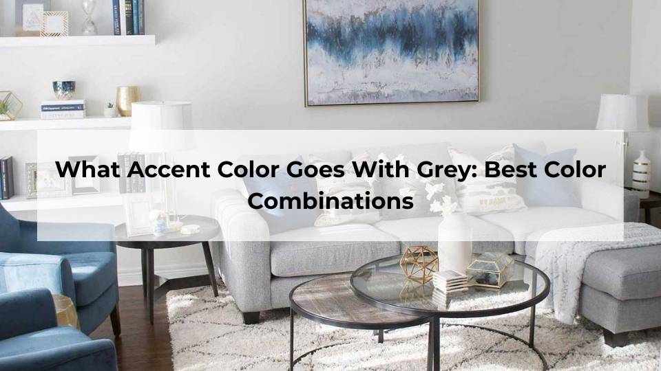
What Accent Color Goes With Grey: Best Color Combinations
Here’s what took me too long to understand: grey’s undertones determine everything.
Cool greys have purple, green, or yellow undertones which pair beautifully with blues, teals, and jewel tones while warm greys have red, yellow, or brown undertones and they need warmer accents like earth tones, yellows, and reds.
I learned this when I tried to add terracotta accents with a cool grey in my bedroom and it looked wrong and it looked like the colors were fighting each other.
In fashion, the same rules apply. If you’re wearing cool grey pants, pair them with purples or blues and for warm grey pair it with warm greens, camel, or rust.
For interiors layer multiple shades of grey together, then add your accent color. It helps create depth instead of that flat, one-dimensional look.
White & Off-White Accents With Grey for Clean Look
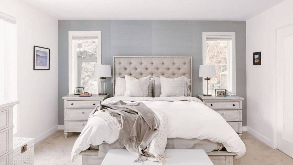
White with grey is the safest combination. And I don’t mean that in a boring way as it looks cool and clear.
When I was picking out my wedding outfit I wore a grey suit and paired it with a crisp white shirt which made it look clean, classic and it worked perfectly because white just makes grey pop out more.
In interiors, white trim against grey walls is a perfect choice as it looks really good and creates contrast without being too bold. I did this in my hallway and the space instantly felt bigger and brighter.
Off-white is even better sometimes as It softens the whole look. I used an off-white with a medium grey in my living room and the room looks fulfilled.
Designer tip I used: Use off-white or white on trim, ceiling and baseboards and let the grey walls do their work and then add colorful accents through decor.
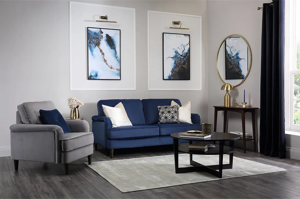
Blue Accents with Grey for Calm Look
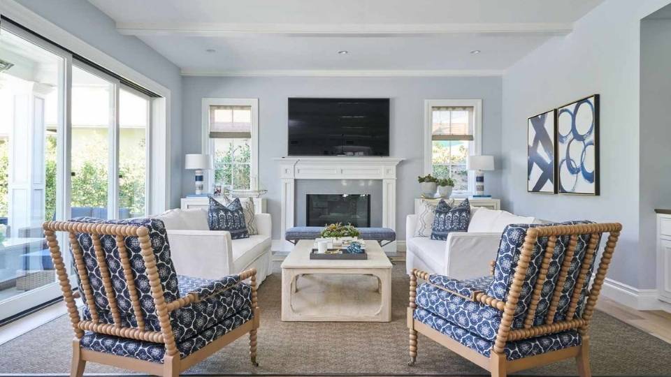
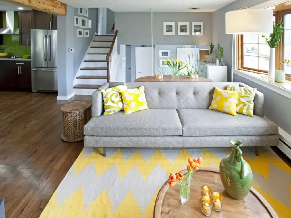
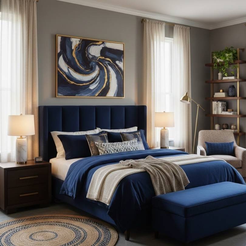
Cool greys with blue undertones with navy blue or sapphire accents look stunning. I have a slate grey couch and added navy pillows and it made the room feel calm and refined that I absolutely love.
In clothing, grey pants with a cobalt blue top is one of the best outfits as It looks polished without being too hard.
In the bathroom, I went with cool grey tiles and added a shower curtain and pale blue towels which made the bathroom feel like a spa and it gave an amazing view in the bathroom.
The trick is matching the temperature. Cool blue with cool grey works better than warm grey as it looks dull and bad.
Lighter blues like sky blue or powder blue look great in bedrooms and create a calm look. I did this in my son’s room and it’s calm and the bedroom doesn’t look bad anymore.
Soft Green Accents with Grey for Fresh Look
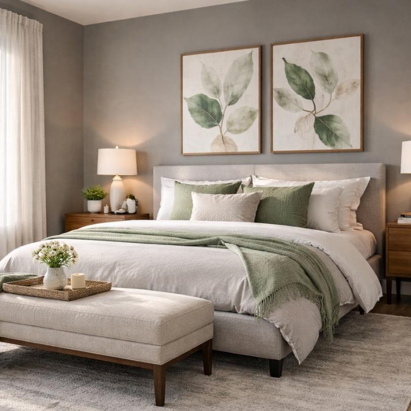
Green actually makes a difference and it completely changed how I felt about grey.
Wait and let me tell you about Soft greens, Sage, mint, olive. I tried that once in the kitchen and it was astonishing.
Sage green with warm grey is probably the best combo as it creates an earthy and fresh look at the same time.
I tried adding some sage green plants and some sage threw blankets in my living room and the grey walls suddenly felt alive instead of flat.
For fashion, olive green jackets with grey jeans is a perfect combo. It’s like that casual outfit pulled together that doesn’t look bad “I spent an hour on this.”
Tip from my mistakes: Don’t go too bright with green. Keep it muted. The grey should still be the star.
Yellow Tones with Grey for Warm Look
Yellow was scary for me at first but mustard yellow with warm grey looks gives more balance.
I was so nervous adding yellow pillows to my grey couch. I thought it would look like a bee or something. But golden yellows and mustard tones add this warmth that grey desperately needs sometimes.
In my kitchen, I have grey cabinets and I added a mustard yellow rug andIt made the space feel happy though it sounds cheesy but it’s true.
For outfits, a grey blazer with a soft yellow shirt underneath is a professional and solid choice. I wore this to a parent-teacher conference and actually got compliments From other persons present at the conference and That’s how i got to know how it works
Brass and gold metallic accents also count as yellow-tones where I added brass cabinet handles to my grey kitchen cabinets and the whole room looks more expensive.
Don’t do bright lemon yellow though I tried that in a bedroom once and it was way too energizing and I was not able to sleep because of that I had to paint over it within a week.
Red & Black with Grey for a Bold Look
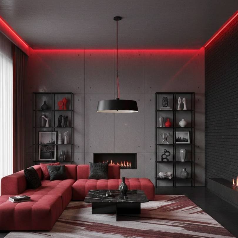
If you want drama or bold type look this is your perfect choice
Black with grey creates tonal contrast and looks refined and modern. I have charcoal grey walls in my entryway and I added black-framed mirrors and black hardware which made it look pleasing without being colorful.
In fashion, black and grey together works as a power combo. Grey suit with black accessories, grey dress with black heels and It just works.
Red accents with grey are bolder in look while Burgundy or deep red work best. I tried bright red once with a cool grey and it looked bad and made no sense.
But burgundy pillows on a grey couch looks beautiful. Terra cotta (which is like a red-orange earth tone) with warm grey is also a good choice as it looks aesthetic, warm and grounded.
My friend did charcoal grey exterior siding with a deep red front door. It’s bold but it works. Everyone in the neighborhood talks about her house.
How Different Accent Colors Look with Grey in Different Rooms
Why one needs to be specific because what works in a living room doesn’t always work in a bathroom. Learned that one the hard way too.
Living Room
Your living room is where you can actually take risks with accent colors.
I have grey walls in my living room (Benjamin Moore’s version of a warm grey which has brown undertones). I tried about five different accent color combinations before landing on the right one.
What works in most cases:
- Navy blue and brass metallics
- Sage green with natural wood tones
- Mustard yellow with white accents
- Light pink with marble textures
If you have grey furniture like a grey couch in your living room, you can use bolder wall colors and accessories.
I added a cream blanket, powder blue, and some green plants. The grey couch grounded everything and the colors didn’t feel overwhelming.
Grey walls give you more freedom. You can use colorful pillows, bold artwork, vibrant rugs and the grey looks neutral and letting everything else shine.
Designer tip I used: I Used the 60-30-10 rule here where 60% grey (walls, big furniture), 30% neutral accent (like white or cream), 10% bold color (pillows, art, accessories).
Lighting is one of the main things which matters so much. My living room gets lots of natural light so the cool grey I initially picked looked too blue and cold so I had to repaint with a warmer grey and now it looks perfect all day long.
Bedroom
Bedrooms need calming accent colors with grey which isn’t the place for bright red or electric yellow.
I did soft pink accents with light grey walls in my bedroom and it’s the most peaceful room in my house and i also added some Blush pink pillows, a pink throw blanket, some pink-toned artwork which made the bedroom look more beautiful
Blues work beautifully with grey in the bedroom too and Pale blue or dusty blue with grey creates that calm vibe. My daughter’s room is grey with lavender accents and she actually sleeps peacefully.
For grey bedding, add texture. Once I made the mistake by doing all flat grey linens and it looked like a sad hotel.
Now I layer different grey tones with varied textures – linen, velvet, knit and Then added white sheets and colored accent pillows.
Surrounding elements that work:
- Natural wood furniture warms up cool grey walls
- White trim keeps it fresh
- Metallic lamps (brass or chrome depending on your grey’s undertone)
- Plants always help
Best tip: From what I have seen, keeping metallic accents consistent in all bedrooms and all brass or all chrome while mixing them with grey looks chaotic.
Bathroom
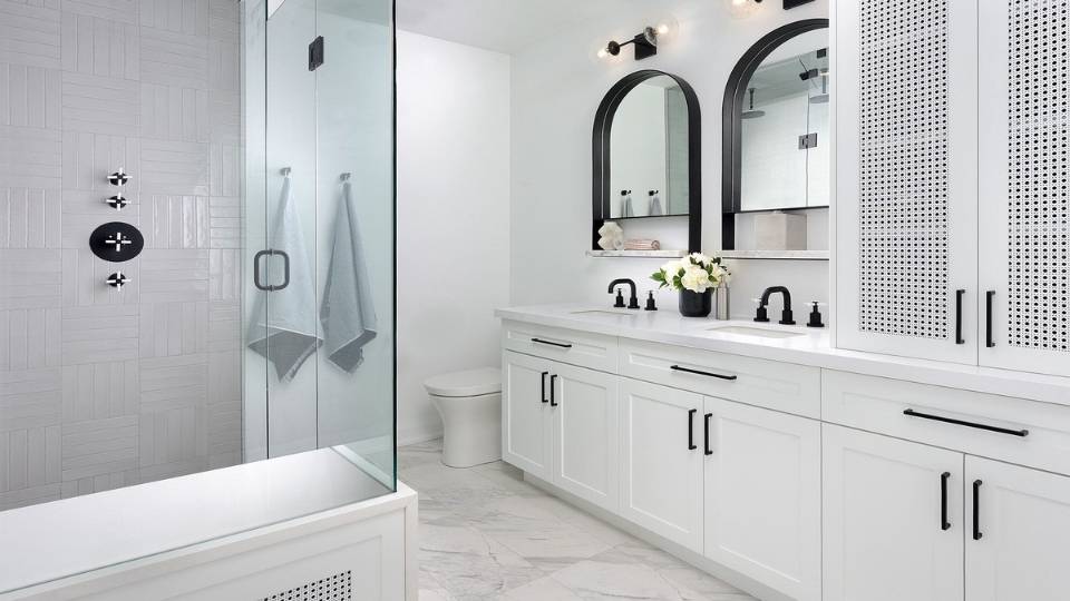
Bathrooms and grey are perfect together, It’s like they are worth keeping in your bathroom
I have cool grey tiles in my main bathroom with white grout and then I added chrome fixtures and pale blue towels and it looks like a spa and clean.
For accent colors here, try to stick with:
- White – always works, makes it feel bigger
- Pale blue – calming and fresh
- Mint green – I did this in my powder room and i loved it
- Black – for drama use black faucets with grey tile
Surrounding elements that work:
- White tile with grey grout is looks great
- Natural stone in grey tones adds texture
- Plants if you have a window soften everything
- Chrome or matte black hardware depending on your choice.
What I learned from my mistakes: Don’t go too dark with grey in small bathrooms. I did charcoal grey walls in a tiny powder room once and it felt like a cave, after that I went with light grey instead and it’s so much better.
Also, test your grey tile in the actual bathroom lighting first before committing. Once I picked a grey that looked green under my bathroom’s warm lighting and helped me avoid a disaster.
Kitchen
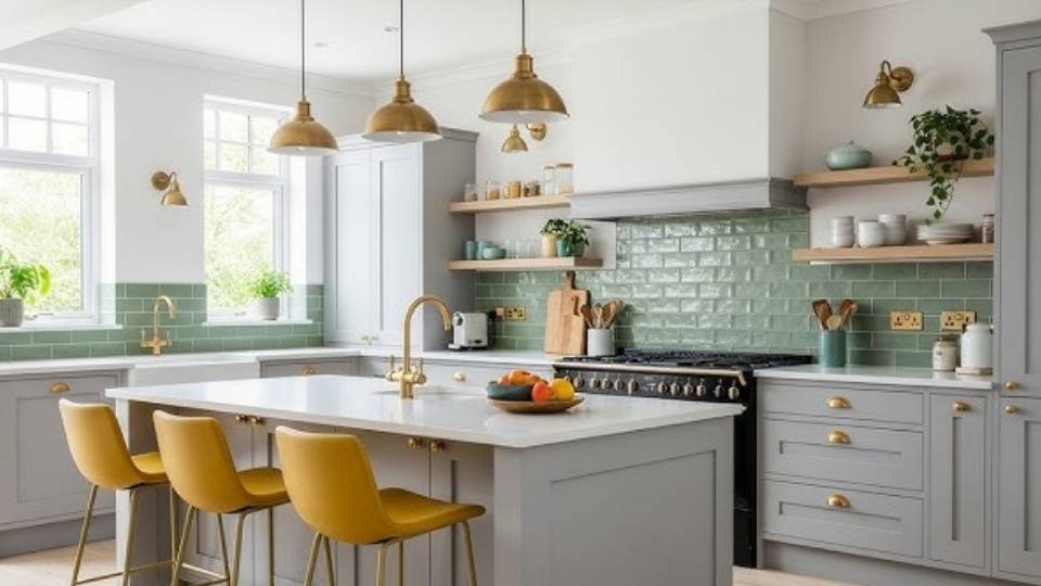
Grey kitchen cabinets created a great moment so I redid my kitchen two years ago with grey cabinets and It made me love my kitchen more.
What accent colors work:
- White countertops and backsplash for classic and clean look
- Warm wood tones for flooring or open shelving
- Brass or gold hardware
- Pop color in accessories, I did mustard yellow
If you have grey cabinets, your wall color matters. I went with a very pale greige for the walls so the cabinets stand out and then I added warmth through wood cutting boards, brass faucets, and plants.
What wall color goes with grey cabinets is White or off-white is as it is the safest choice and pale blue, soft green, or even a warm beige works if your grey cabinets are cool-toned.
Kitchen surroundings:
- Stainless steel appliances complement grey naturally
- White or marble countertops keep it bright
- Wood elements like floating shelves, stools add necessary warmth
- Colorful dish towels and accessories are easy accent updates
Designer tips i used:
- Grey cabinets, grey walls and grey countertops don’t work because too much grey looks depressing
- Add one warm element like wood, brass, or warm-colored accessories.
- Under-cabinet lighting helps grey kitchens not feel dark
My kitchen gets limited natural light so I was worried grey would make it darker, But I paired it with white quartz counters and good lighting worked perfectly.
What Accent Color Goes With Grey: Tips and Ideas
Okay this rule helped me when I was looking out.
Here’s how to use it:
- 60% = your dominant color (grey)
- 30% = your secondary color (usually a neutral like white or beige)
- 10% = your accent color (the fun pop of color)
In my living room: 60% grey walls and couch, 30% white trim and curtains, 10% teal pillows and accessories.
It creates a balance while not crowding the space with too much of any one color and the grey gets to be the star while your accent color does its job
For fashion, the same concept goes – Grey pants (60%), white shirt (30%), burgundy accessories (10%) looks balanced.
Natural light changes everything about grey.
My dining room faces north and barely gets direct sunlight so I painted it the same grey as my south-facing living room and the results were totally different.
The dining room grey looked flat and sad because of that i Had to repaint with a warmer grey.
Wear your grey paint in the actual room at different times of day like Morning light, afternoon, evening, and artificial light. I now buy sample pots and paint big squares on the wall and live with it for a few days and it’s totally worth it.
Artificial lighting also impacts how accent colors look with grey:
- Warm bulbs make cool greys look less blue, warm up the space
- Cool/daylight bulbs make warm greys look more neutral
- Dimmer switches help adjust the mood
Surrounding elements that work:
- Wood tones – Oak, walnut, cherry all add warmth to grey
- Flooring color – light floors brighten grey walls, dark floors looks dull
- Existing furniture – work with what you have
- Architectural features – tall ceilings, windows
I used hardwood floors with medium grey walls and found that medium grey worked better than light grey as light grey with dark floors felt too cold.
Sometimes texture prevents grey from looking flat. In my bedroom I have linen bedding, velvet pillows, a knit throw, and a jute rug all in grey tones and it looks layered and expensive.
You can also mix smooth and rough textures, shiny and matte finishes for a great look.
Common Mistakes to Avoid While Pairing Accent Colors with Grey
Mistakes are inevitable but while pairing accent colors with grey, you’re likely to get confused, especially when there are so many beautiful colors to pair with.
But let’s get this straight, having too many accent colors is nice but they all can’t go with grey, so you have to choose wisely here.
Stick to one main accent color with one secondary subtle accent. In my living room I used teal as my main accent and then added small touches of brass/gold. And it works because they complement each other.
That’s because when I tried to do teal, pink, and yellow all together it looked a bit crowded. There was no cohesion at all, instead it looked like every color was trying to compete for attention.
Another thing you need to keep in mind are the undertones of the grey that are hidden inside it. They determine whether your grey will look warm or cool.
It’s like if your grey has a cool look then it has blue, green, or purple undertones while warm greys have red, yellow, brown, or beige undertones.
To identify undertones:
- Compare your grey to pure white – what color do you see?
- Look at it in natural light
- Put it next to other greys to see the differences
The easiest way: Match temperatures, cool grey with cool accents, warm grey with warm accents or use neutral accents (white, black, cream) that work with any grey temperature then add your colorful accent carefully.
In my opinion, Greige (grey + beige) is more forgiving because it’s warmer and pairs with more colors.
Conclusion
So here’s what we’ve covered so far in the “What accent Color Goes With Grey” after years of working with grey.
Grey is chosen as a base color because it’s genuinely versatile and it works in almost every room, every style, every application, be it modern, traditional, farmhouse, industrial.
The key is understanding your grey’s undertones first whether it is cool or warm as It helps in determining everything else. Then pick accent colors that match that temperature.
Accent colors merged with grey change the entire look of a space. Navy accents make it refined, Yellow makes it cheerful, Green makes it fresh, Pink makes it soft, while Red makes it bold.
In fashion, the same rules apply: take Grey as your neutral base and then your accent color (shoes, bag, jewelry, shirt) creates the mood.
Start with one accent color and use the 60-30-10 rule. Consider your lighting, add texture and make sure to test your colors before committing.
Grey doesn’t need to be boring or sad. With the right accent colors, it’s refined, calming, and exactly what your space needs.
FAQs on What Accent Color Goes With Grey
Best accent colors for grey include white, navy blue, soft greens, mustard yellow, blush pink, and earth tones. The specific color depends on your grey’s undertones – cool greys pair better with blues and greens, while warm greys work with yellows and earth tones.
White, soft blues, and pale pink work beautifully with light grey and I personally love pairing light grey with crisp white trim and soft blue accents for a fresh, airy feel. Brass metallics also add warmth without overwhelming light grey.
Bold accent colors work best with dark grey like charcoal. Try jewel tones (emerald, sapphire, burgundy), mustard yellow, or crisp white for contrast. I use white and brass with my charcoal grey and it’s dramatic but sophisticated.
Warm accent colors like mustard yellow, terracotta, rust, coral, and earth tones make grey feel warmer. Natural wood tones and brass metallics also add warmth. I added mustard pillows to my cool grey couch and it completely changed the temperature of the room.
Contrasting colors make grey pop – white for brightness, black for drama, or bold colors like teal, coral, or yellow. Metallics like brass and gold also make grey stand out. The key is creating enough contrast so the grey doesn’t fade into the background.